Final Presentation for Cinema Project
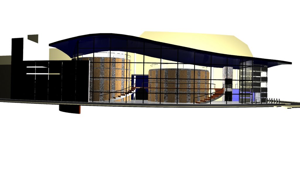
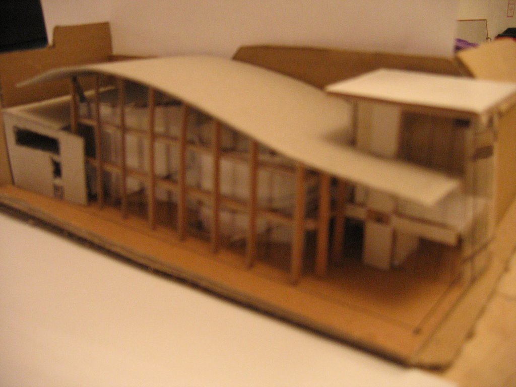
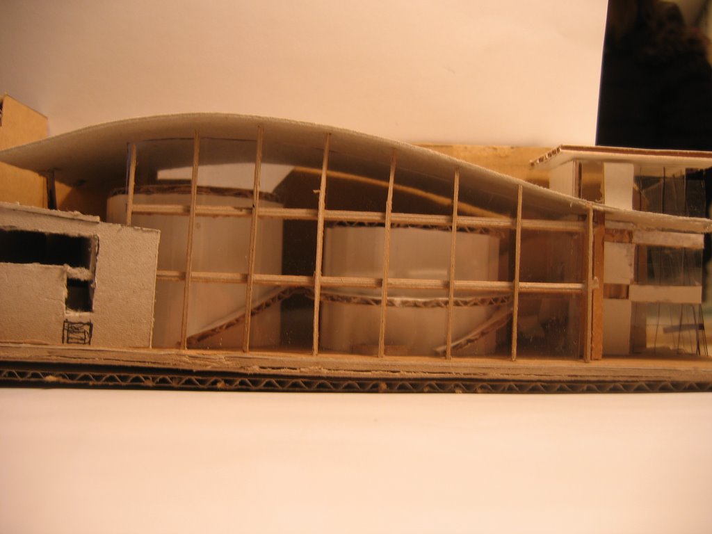
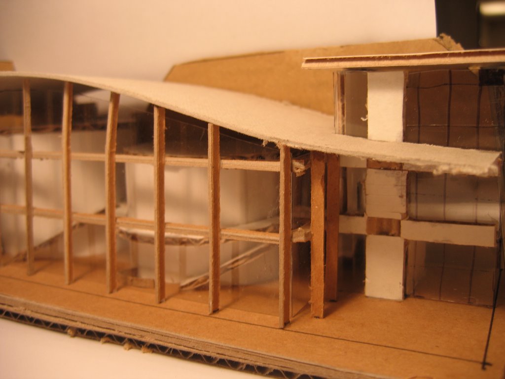
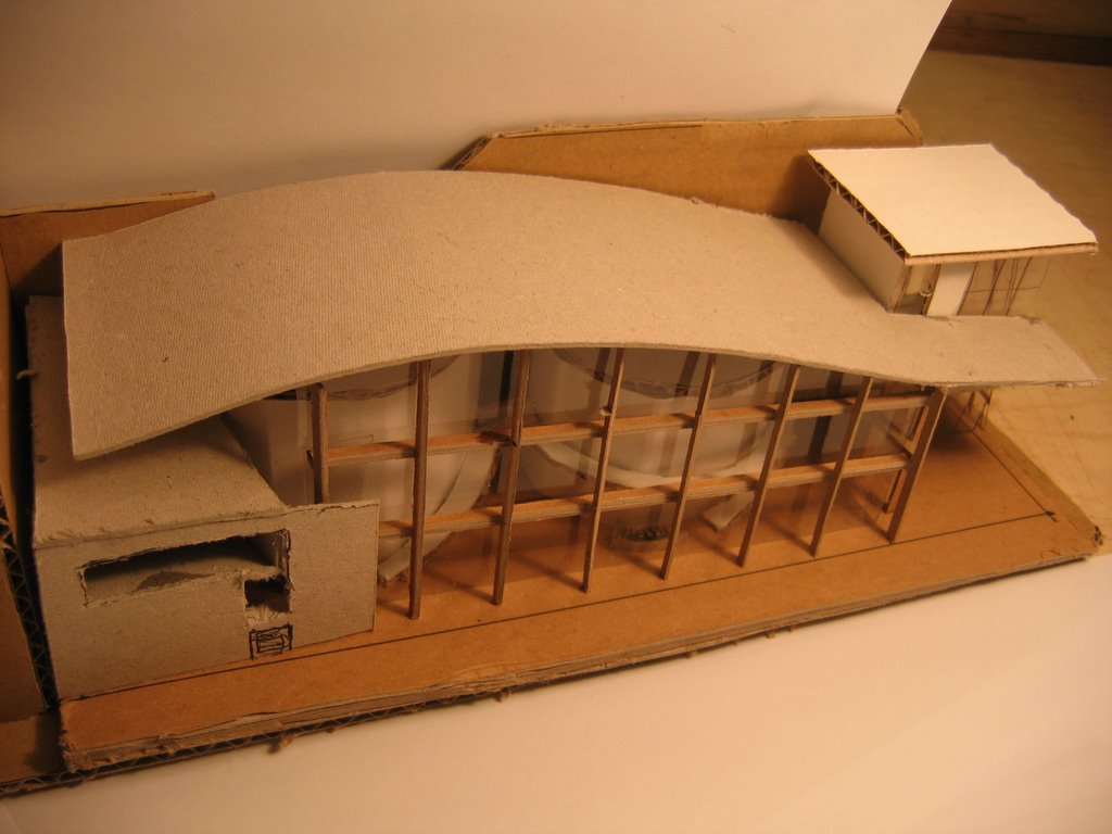
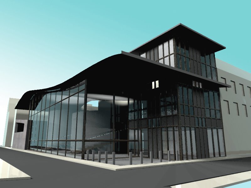
From the first concept and sketches, I've taken the building through quite a few changes. Although the some of the main ideas and concepts remained throughout, the overall design changed drastically from the beginning. My design at mid critiques was developed further, as well as simplified to a simpler form. I could stand to simplify the building even further, however.
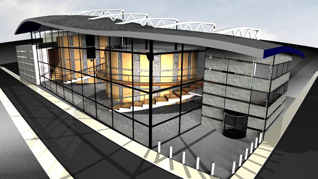
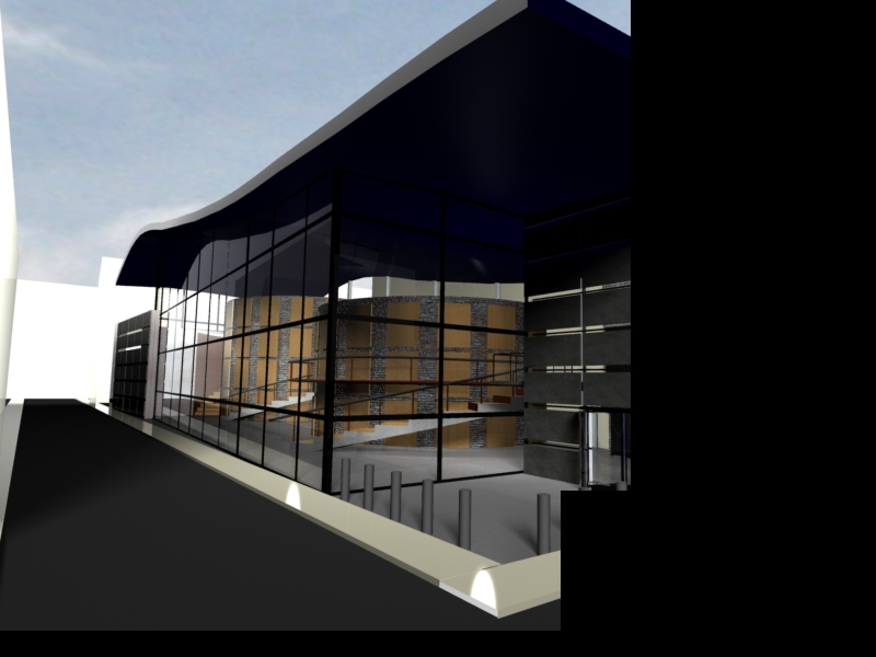
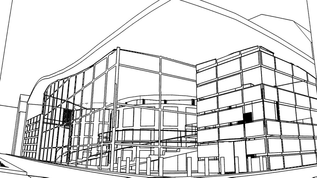
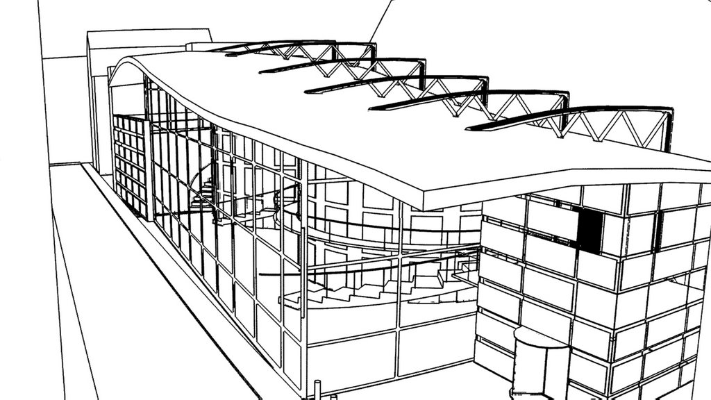
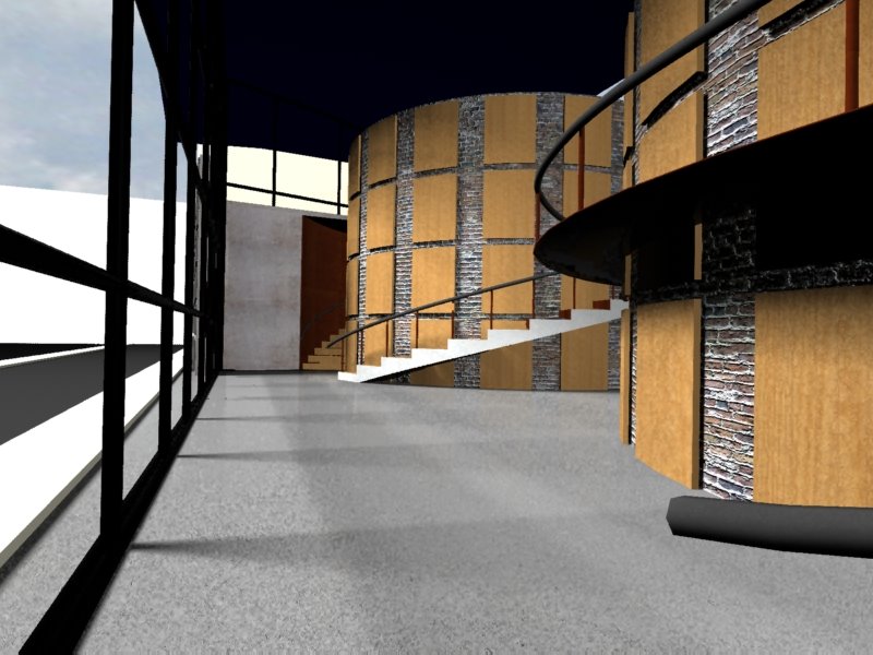
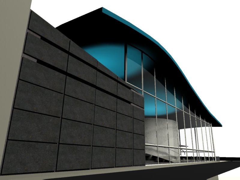
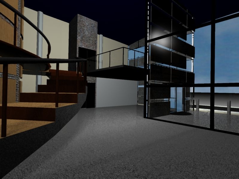
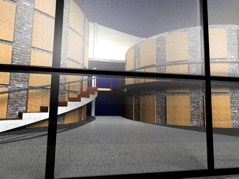
The main concept of breaking up the facade, and trying to relate the surrounding buildings stuck throughout the project. However, the final concentrated on only three seperate facades, instead of the multiple facades I had created early on. I developed the final idea through the process of how a film goes about telling a story. I wanted my building, since it is a movie theater, to tell a story with the same outline. There is a beginning/introduction, a middle/climax, and and end/resolution. The entry to the theater had to be bold, attractive, and inviting. I wanted to audience to be pulled into the building and want to experience the rest it has to offer. The mid section of the building houses the main purpose of the building, why people are there, which is the theaters themselves. The large cylidrical forms house two small theaters within. The idea of the forms was to try and create a "world away from the ordinary". Similarly, a film takes you somewhere out of the normal. It transports you by manipulating your senses and emotions. By placing these large forms within another form, it creates that "world within a world" feeling. The last section of the building is the resolution, it is the ending to the experience. I didn't want to just move the audience straight out of the building to the street. And I didn't want to have them go out the same way they came in. That is a boring approach since they've already experienced that space. So with that in mind, I created a small cafe that people can go to after the movie. It is a more intimate space that allows them to talk about the movie, and relax before they finish the experience of the theater. So, that's the design, I'll let the pictures do the rest of the talking. Enjoy.