Mid Project Gallery Critiques
I have officially landed on a good design. It is well planned, well thought out, and well on its way to being one of those projects that I highlight in a portfolio. I really like the way this project is turning out. I have pictures/renderings/sketches to show, so I hope you like what I've come up with!
My original concept of keeping the facade as broken as possible is still represented in this design. Its an idea that I've carried through the entire process. However, I began thinking about what the building is, and what it can be as well as represent. Focusing on the idea of a movie, I began constructing a movement, or animation, through the spaces of the building. The design concept grew from the construct of a film: Beginning or introduction, Middle or climax, and end or resolution.
With these three basic elements in place, I was able to direct the circulation of my building through a "movie." I began with the entry. A movie's introduction and start has to really sell the audience, make them want to continue to watch. The same applies to this design. The entry was crucial in attracting audiences to come watch movies here rather than another cinema in the area. I deteriorated the corner, as in early designs, and created a semi-plaza that people can congregate in. There will benches and rails to rest on.
After the entry, the guest will turn the corner to see the ticket booth with lounge area around it. From there they can either stay on the first floor and sit before the movie, or journey upstairs to the cafe preceding the movie. Friends can wait for others and have a cup of coffee as they comfortably wait for their film to begin.
The climax of the design is within the theaters themselves.
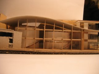
For them, I have created large cyclindrical forms to house each individual theater. The glazing towards the front of the building serves as a screen for those outside to watch the "movie" taking place inside. I took inspiration from much of Renzo Piano's work in Berlin with the Potsdamer Plaz reconstruction, which you can see to the right.
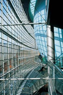
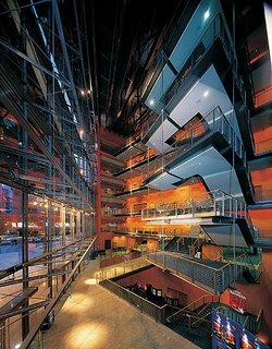
The large sphere is an inspiration for the cylindrical forms, and the large glass facade on picture two is the look I was aiming for in creating a large interior atrium of light and space.
The building comes to a resolution with a cafe leading out onto the street. Instead of sending people straight out of the building to the outside, I created a softer exit from the dark interior space of the theater. No one likes a movie that cuts abruptely to the end, it seems shortsighted and not well planned. The same goes for the design of this building. I wanted to send my audiences out by lightly letting them down from the experience of the film. Not to mention, at the cafe they can talk about the movie and what they enjoyed or not.
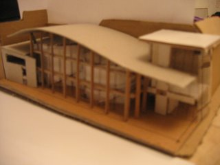
Sustainablity is also an issue, and the curve of the roof takes care of one of the most important issues with a large crowd in a building: ventilation.
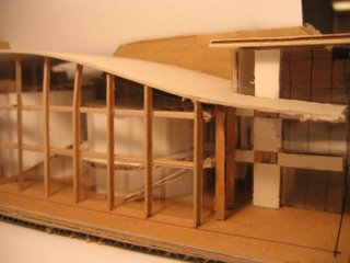
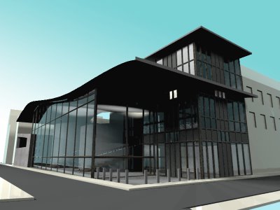
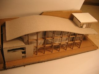 Having the curved roof I was able to direct the flow of wind over the building into the entry tower. Acting as a chimney effect, the wind would blow through the tower, pulling the air up through the building as it exited out the other side. The mere heat of the people will also be enough to enduce stack ventilation up through the tower as well. The glazing along the front facade is no more a concern than if it were facing north instead of southwest. There is a large, 5 story building directly across the street, and the sun only directly hits a very small portion of the top glazing sections. For this, I have extended the roof slightly to protect against the direct sunlight in the summer. Most of the year, no direct sunlight will hit the face of the building below the roof line.
Here is a 3D render, using 3D Studio Max 7 and the Brazil renderer.
0 Comments:
Post a Comment
<< Home